My file organization: Directory: “R Course”, Project: “Graphing”, File: “Intro to Graphing”
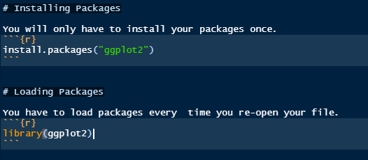
For graphing in this course, you will need the package “ggplot2”. We will be using data from “iris” again.
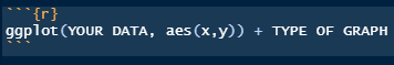
This is the general code for ggplot2:
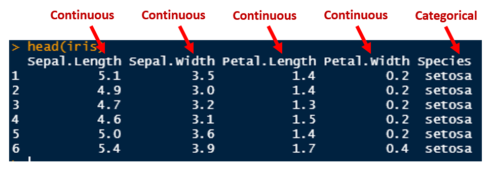
I like to start with thinking what type of data that we have: continuous or categorical – very simply continuous data are numbers and categorical are characters BUT sometimes you may want your numbers to be categorical like if 1,2,3,4,5 were student group numbers. Now identify within your dataset which columns are continuous or categorical:
Lets take a look at our chart to see which kind of [most common] graphs we can do:
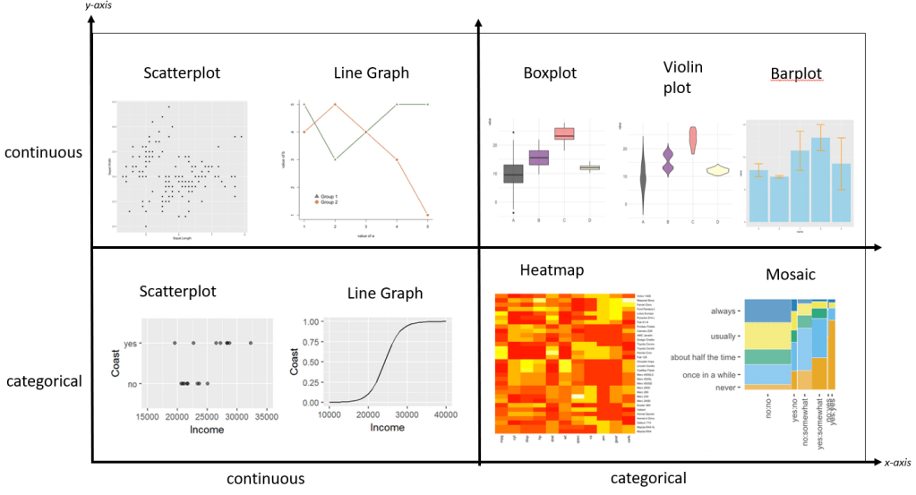
Sources for graph screenshots:
https://mgimond.github.io/Stats-in-R/Logistic.html
https://r-graph-gallery.com/index.html
Once you have picked which type of data (categorical or continuous) you have on your axes, we can start making our graphs!
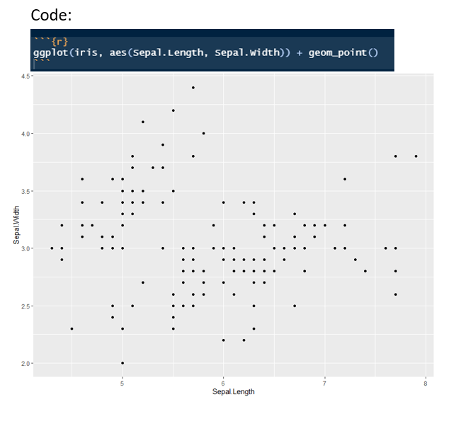
Let’s work through an example and see what else we can add to our graph with the iris data.
Let’s add a linear regression line or line-of-best-fit for linear data:
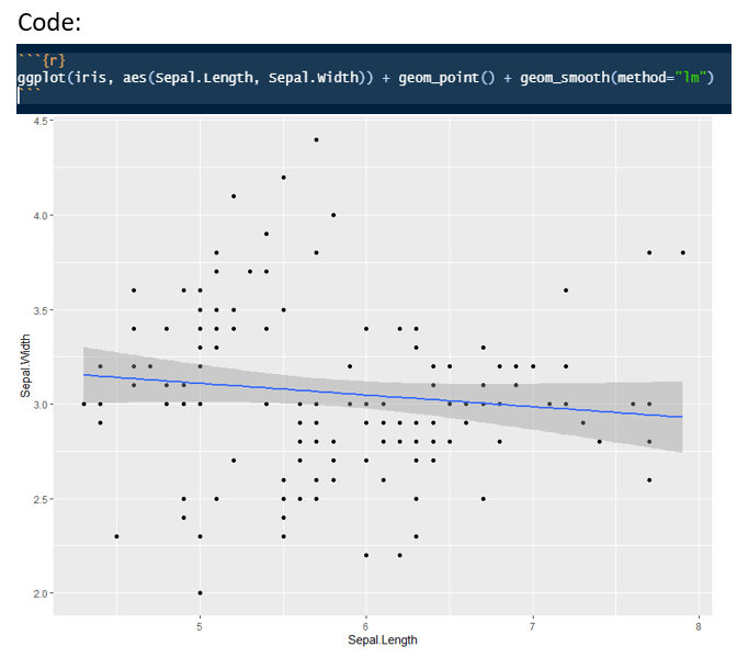
But this line of best fit isn’t correct. Why? Because we have three different species all jumbled into the average line. Remember when we summarized the means of the three different species in our Data Summarization course? The averages we’re all different, and we can have our graph represent this.
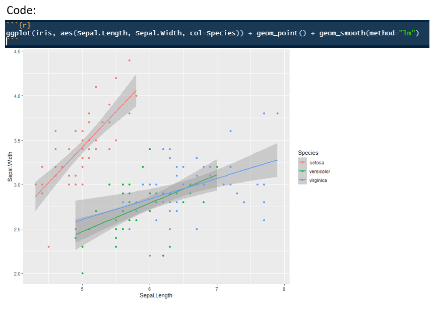
By adding “col=Species” I told R that I have 3 categorical variables I would like to include in this graph.
We can also do a boxplot using this data, if we have a continuous variable on our y-axis and a categorical variable on our x-axis.
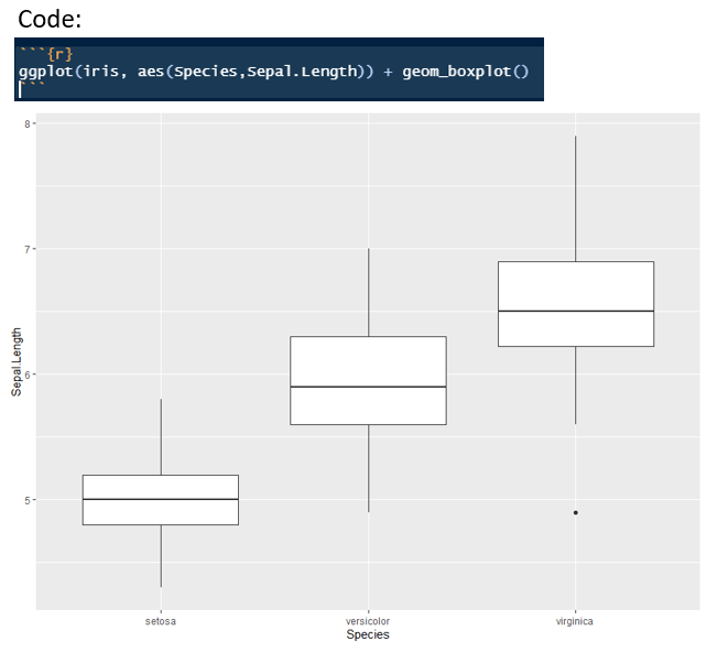
Do you notice how our box’s do not have any colour? Well we can add it with the “fill” function:
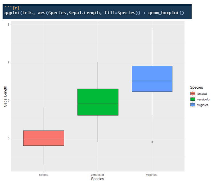
Notice how in the scatterplot to add colour we used the “col” function and for the boxplot we used the “fill” function. This is something I want you to note, when you are trying to colour a categorical graph you will need to use “fill”, but for continuous graphs you will use “col”. If you mix it up, no worries, you might get an error, or no colour showing up in your graph, just switch it up!
Want to learn more about ggplot and the graphs you can create? Check out this site.
Want to make better graphs, change colours, shapes, etc? Just google it! I’m serious it’s as simple as googling “remove legend in ggplot2” or “change boxplot colours in ggplot2”
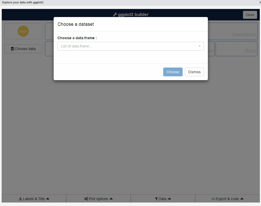
Are you tired of having to code your graphs? Try the equisse package. It makes building graphs with ggplot2 even easier. Just install and put the package into your library. Look at everything you can do: